Well Rounded
Description
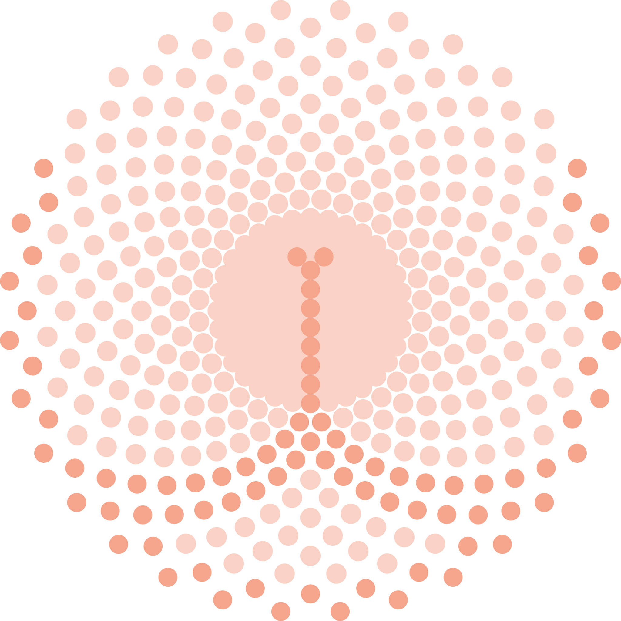
This is a peachy logo made for Jyordana Barsuglia of "Well Rounded" - a health of mind and body fitness studio.
The origin of this work is admittedly a peculiar one, as the metric for success was set by the client. Simply put, the logo should bear resemblance to three things; the letter "w", a posterior, and a bust. Doing so in a meaningful way while maintaining the guru sort of vibe I initially envisioned was challenging, to say the least. The fair-skin tone color really allows the triple-entendre to coexist.
With so much focus on the graphic itself, we ended up cycling through quite a few fonts. "Typo Round", "Run", "Esphimere", "Rolade", "Alte Haas Grotesk", and "Discoteca Rounded" completes the cavalcade of font families proposed for this logo.
Gallery
Previous work
Next work

